eql. ―
Bill Splitting Application
A mobile platform that aims to make the restaurant bill splitting process as simplistic, intuitive, and effective as possible.


Role
Sole Designer
Timeframe
September - October 2021 (4 weeks)
Tools
Figma, Adobe Suite (PS, AI, AE), Principle, Useberry
Platform
Mobile, iOS
OVERVIEW
We’ve all been in the scenario where you’re out for dinner, the server leaves the check at the table and someone needs to step up to the plate and say “Venmo me later!”. When all items ordered are consolidated on one single bill, one person always needs to pay as well as be paid back by everyone in the group.

OVERVIEW
Understanding the User
1
Informing the Server
The server can handle dividing bills more promptly and efficiently if customers request separate bills before giving their order to the server.
2
Placement Disparities
In Canada, the server almost always asks how to separate bills before bringing the check. Although accepted, it is not as common in the U.S.
3
Sentiments
Most people feel a slight negative emotion when asking their server to split their bill up.
4
Eliminate Math
Doing the calculations is the biggest pain point after dining, especially in larger groups or with alcohol involved.
OVERVIEW
Solution
The goal is to help users save money and time by informing them what they ate as well as eliminating human errors while computing individual portions during the split process. The objective is to create unique and user-friendly solutions to improve the experience of splitting customers’ bills, to allow them to relax and enjoy their meals.

The Challenge
OVERVIEW
Process
My process was based on the revamped double diamond design process framework, a specific framework that I had not tested until this project, but is one of my favorite frameworks due to its simplicity and linear process.
RESEARCH
Competitive Analysis
To build a clear and precise foundation for eql, I had to go off and look at what the most prominent bill splitting applications were currently doing and what user objectives they weren't achieving. I looked at a number of features that user surveys regarded as important and determined which ones eql might employ to get an advantage over competitors.

RESEARCH
Evaluating Activity
Take it from the generation that eats out most: 43 percent of millennials surveyed said they would ask for separate checks when dining out with friends, and it’s not because they are frugal with their budgets.
While a common rule of thumb is that, unless discussed ahead of time, diners should expect to split a tab equally, research suggests most diners don’t actually do this in practice. In fact, two-thirds of those surveyed do not split the bill evenly when dining out with friends.
Source: Forbes, Aug 2020. Mint Intuit, Apr 2019.

RESEARCH
Interviews
A set of semi-structured and contextual-interview questions were used as a standard framework for each of the interviews. I conducted the interviews among people of different ages, genders, occupations, and dining habits. I let the interviewees really lead the talking. The purpose of the interview was to learn about each person's mindset and solution to bill splitting difficulties.

RESEARCH
User Voices
RESEARCH
Surveys
To fully understand the user problem at hand, I conducted a survey of 59 individuals. The goal of the surveys was to test my assumptions against current pain points in the scope to determine what specific requirements are necessary for what content and functionality the product will offer to users. The demographic extended from students, wait staff, to restaurant customers accessed by QR codes at dining tables.


RESEARCH
Key Findings
1
Users Want Versatility
Users complained that previous applications didn't provide them complete control over simple activities like identifying products or adding tips/taxes to computations. They also want a system that allows them to use their preferred payment applications.
2
Manually Calculating Is a Hassle
Users were irritated that they had to split the cost with a calculator or even a piece of paper. They also dislike how long it takes to divide the bill, since it often draws their attention away from the current topic. Many of them, on the other hand, want to pay their part of the cost straight away.
3
Social Pain Points
Several users stated that servers are usually too preoccupied to divide the check, therefore customers would prefer to split the bills themselves rather than ask the server.
4
Uneven Split
Options consist of splitting the entire bill, which is dividing the bill by the number of individuals at the table. The second option is to pay for each order separately. People, on the other hand, frequently overlook the taxes and tip added at the end.
SYNTHESIZE
GAP Analysis
I extracted the pain points and user needs, translating them into potential features. I found out that eql’s target user seeks a straightforward platform, where all groups, scanners, and payment methods are available within one place.

SYNTHESIZE
Meet the User

SYNTHESIZE
Scenario Mapping
I ran through a quick scenario map as an exercise to help me break down all the ways that a user might approach solving the problem, and how my persona segments might approach dilemmas using eql and ideate around the type of experience I want to provide for them.

SYNTHESIZE
Affinity Mapping
I utilized an affinity map as a practice to organize my ideas and insights. It maps out large numbers of difficulties and emotions that the user would face on their journey, based on their natural relationships, for review and analysis.

IDEATION
Design Requirements
Now that the research has been synthesized, it’s time to clarify the scope of the project and decide on the design requirements for the MVP to be successful.

REQUIREMENT 1
Uploading a Bill
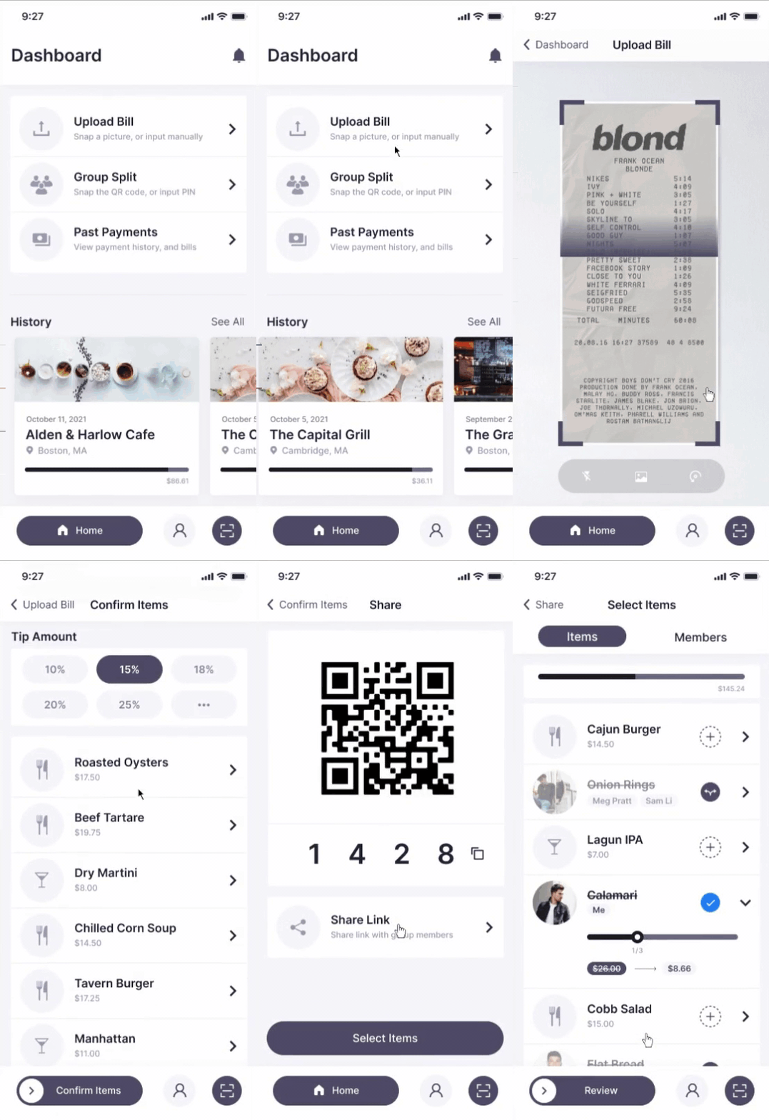
Eql gives the user the option of inputting the bill items manually as well as the option to analyze the bill utilizing OCR to instantly create a digital bill and group tip that can be shared via QR code, group PIN, or a personal link.

REQUIREMENT 2
Joining a Group Bill
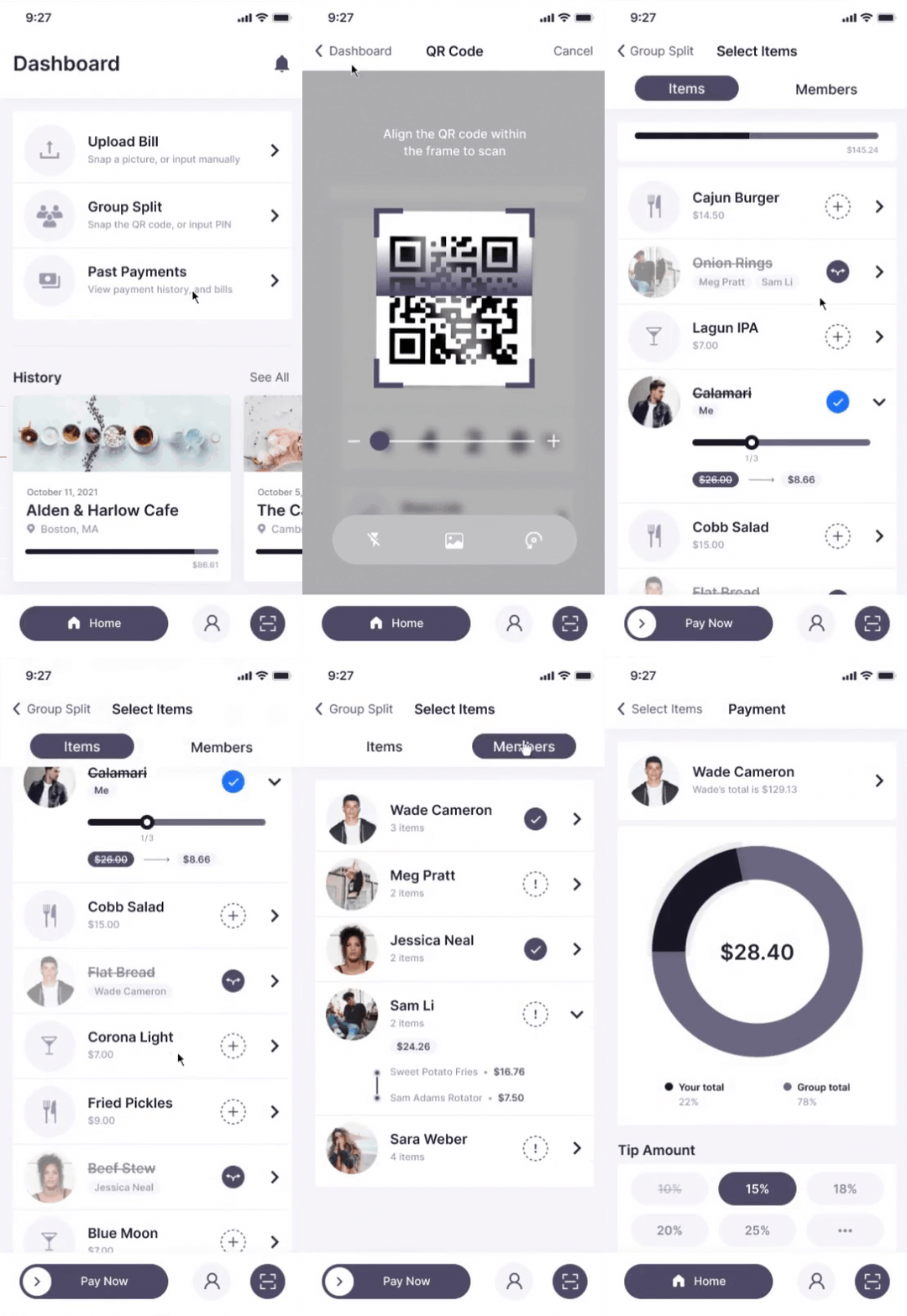
A method for users looking to join a bill may do so through scanning the bursars QR code, entering the group PIN, as well as entering through the external personal link provided by the bursar. Users may then claim their items, and additionally split items with other group members.

REQUIREMENT 3
Quick and Easy Payments
Users may enter all of their payment methods through their profile settings. Once a user has completed claiming their items they may input a tip percentage, select a payment method, and complete their transaction.
IDEATION
Prioritization Plotting
Using a 2x2 matrix to plot a list of the prospective features helped narrow down what was absolutely necessary for delivering the MVP and what could be improved upon later in the process.

IDEATION
Information Architecture
The next step of my process is to create an information architecture diagram as a discipline to focus on the organization of my information within the product. To figure out what features were the most relevant I layed out each individual page so that every avenue and path that users can take through the product is as linear and simplistic as possible.

IDEATION
User Flows
Understanding the different points of communication from feature to feature, user to device, and user to user, as well as being able to get a better grasp on the scope of this project. By doing this sooner rather than later I was able to layout the user's movement through the product, mapping out each and every step the user takes—from entry point right through to the final interaction.
IDEATION
Wireflows
Wireflows have helped me think in terms of flows rather than screens. With wireflows, I don’t work screen by screen but rather with the full flow. Wireflows are useful in projects such as this, with complex interactions and a small number of unique pages.

IMPLEMENTATION
Low-fi Mockups
To move from the conceptual phase to the implementation phase, I designed the low fidelity mockups to explore different ranges of flexibility, and creativity to implement for the testing phase. The mockups helped reduce the creation of unnecessary design components that might eventually be scrapped when developing the high-fidelity mockups.

IMPLEMENTATION
Mid-fi Mockups
After prototyping some P&P wireframes, I reviewed the necessary features and focused on screens that needed improvement. I designed 3 sets of mid-fi wireframes that are essential to the concept - Bill Uploading, Groups, and Payment Methods.

Requirement 1: Analyzing and Uploading Bill

Requirement 2: Joining Group, and Claiming Items

Requirement 3: Painless Payment Methods
IMPLEMENTATION
Styleguides and Components
To be able to keep things in order, consistent, easy to update, and easily referencable by engineering, I put together component guides complete with specifications.

EVALUATE
Mid-fi User Testing
For the second round of testing, I created digital wireframes. The goal was to get feedback on the refined concept and test out specific functionality and user flow.
To evaluate the prototype, I conducted a remote un-moderated task-based usability study with 21 participants spanning across people both with rare dining habits, and power users who are regularly going out to dine with friends.
Each user was given identical tasks with multiple UI versions in order to conduct A/B and multivariate testing to discover which was the best in terms of usability and functionality. The participants were then asked to explain their cognitive processes while doing the tasks in a qualitative survey.

EVALUATE
Usability Testing

The prototype garnered predominantly positive feedback. Participants were able to complete the benchmark tasks effortlessly, and the survey provided qualitative information on the prototypes’ experience.

EVALUATE
Usability Testing Takeaways
1
Emotional Connection
If a user joins the application and sees the names of their friends on the dashboard (from contact list of a phone) it builds trust, as well as simplifies the social and sharing features.
2
Paid Items
Items that are already paid by other users should disable and change the appearance by lowering the visibility, striking the title, and adding the current payee’s name in real-time.
3
Creating a Universal Language
Content strategy is crucial when researching. Choosing plain-language words and CTA’s takes some thought. I had to fine-tune them to reflect the users’ personal stories, and in their vocabulary.
4
Registration & Payment
When creating an account it should require the user to link at least one payment method prior to being able to access the group or payment features.
DELIVERY
Final Product
I finished the high-fidelity version of the project after many phases of implementation and iterations. The visual design was created to keep up to date with current UI trends, and human interface guidelines.
REFLECTION
What this project has taught me
Sketch More Often
By spending so much time in front of screens, it makes me less and less comfortable with using pen and paper. Being able to quickly sketch ideas in p&p style, or on an iPad, helps me understand the story much better.
Accomplishing Time-Boxed Goals
Setting metrics to success, and planning them pursuant to timelines was one of the challenging aspects. Despite the fact that the project was timeboxed I managed to bring out a successful MVP to serve users.
Enjoy It!
I design because I love it, and by having fun with it I get my best work done, and the more I work, the less it becomes work.


.jpg)
